

Car Repair Shop Logo Ideas: An Approval Guide for Shop Owners
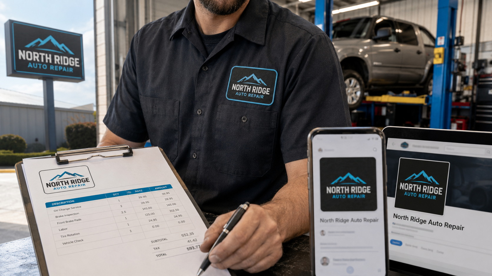
A car repair shop logo has a harder job than most owners expect. It must stay readable on a roadside sign, fit inside a Google Business Profile image, embroider cleanly on a uniform, and still look credible on an estimate or invoice. A concept that looks impressive on a designer’s screen can fail as soon as it reaches the real shop.
The goal is not to find the most detailed drawing of a vehicle. It is to create a recognizable system that makes the shop name easy to notice and easy to trust. Use this guide to evaluate car repair shop logo ideas before paying for signage, uniforms, print materials, or a website rollout.
Contents:
- Start With the Places the Logo Must Work
- Choose the Right Logo Structure
- Seven Design Rules That Matter in a Working Shop
- Six Original Logo Directions to Explore
- Three Before-and-After Decisions
- Check Availability Before You Roll It Out
- Use This Logo Approval Scorecard
- Give the Designer a Repair-Shop-Specific Brief
- Request the Complete File Package
- Case Study Lesson: A Logo Has to Enter a Measured System
- Frequently Asked Questions
- Approve the System, Not Just the Picture
Start With the Places the Logo Must Work
Do not approve a logo in isolation. List every place customers will see it during the next two years, then rank those applications by importance.
| Application | What the logo must do | Useful test |
| Roadside sign | Make the shop name readable at a glance | View it at the size of a phone screen from across the room |
| Website header | Stay clear on mobile without taking over the page | Test at 160 pixels wide |
| Google profile | Remain recognizable in a small square or circle | Crop it to 64 by 64 pixels |
| Uniform | Embroider without thin lines filling in | Request a one-color stitch proof |
| Invoice and estimate | Reproduce cleanly in black and white | Print on an office printer |
| Vehicle or tow truck | Read while the vehicle is moving | Remove secondary text and check the main name |
This application-first approach immediately exposes weak auto shop logo concepts. If the name disappears when the mark gets small, the design is not ready. If the symbol works only in full color, the shop will keep paying for special production fixes.
Choose the Right Logo Structure
Most mechanic shop logos fall into one of three useful structures.
Wordmark
A wordmark makes the business name the main visual element. It works well when the name is distinctive, reasonably short, and likely to be remembered. A strong wordmark also solves the most important signage problem: drivers can identify the business without decoding an icon.
Badge
A badge places the name and supporting elements inside a circle, shield, or compact shape. It can work well for heritage, performance, off-road, diesel, or specialty shops. The risk is density. Small service lists, founding dates, bolts, flags, and taglines quickly turn a badge into an unreadable patch.
Combination mark
A combination mark pairs a symbol with a clear wordmark. This is usually the most flexible auto repair shop logo system because the full version can appear on signs and the symbol can become a social avatar or favicon. The symbol still needs to be distinctive enough to earn that role over time.
The best auto repair logos are not necessarily the cleverest. They are the ones that remain identifiable after unnecessary detail is removed.
Seven Design Rules That Matter in a Working Shop
1. Make the name the first read
Customers should understand the shop name before they notice a wrench, piston, tire, or car silhouette. If the symbol is visually louder than the name, reduce it or simplify it.
2. Use automotive symbols with restraint
Wrenches and gear shapes communicate the category, but they are also common. A generic icon can be useful as a supporting cue, not as the entire identity. Look for a differentiator tied to the shop: its name, location, specialty, history, or customer promise.
Avoid manufacturer emblems, vehicle silhouettes that closely imitate protected marks, and certification badges the shop is not authorized to display.
3. Select type for distance, not personality alone
Condensed and script typefaces may look fast or premium, but they often collapse on signs and embroidery. Start with a sturdy primary typeface that distinguishes similar letters and numbers. If the business name includes initials, test whether a first-time viewer reads them in the correct order.
4. Limit the working palette
Two main colors plus a neutral are normally enough. High contrast matters more than choosing a color that supposedly means “trust.” Blue, red, black, gray, and orange are common in automotive branding; none of them is automatically distinctive. The combination, proportion, and consistent use create recognition.
Approve four versions before launch:
- full color on a light background;
- full color on a dark background;
- solid black;
- solid white.
5. Remove service lists from the mark
“Brakes, Tires, AC, Diagnostics, Engines, Transmissions” is signage or website copy, not logo content. A long list becomes illegible and makes the identity difficult to update. Keep the mark stable while service messages change around it.
6. Build horizontal and compact versions
One arrangement rarely fits every channel. A practical logo kit includes a horizontal lockup for a website header and sign, a compact version for square spaces, and a symbol or monogram for very small uses. These should be approved variants of the same system, not unrelated designs.
7. Test the logo in ordinary conditions
Do not judge only a polished mockup. Place the mark on a plain white estimate, a low-resolution profile image, a dark work shirt, and a photographed building facade. Real conditions reveal problems that a cinematic wall mockup hides.
Six Original Logo Directions to Explore
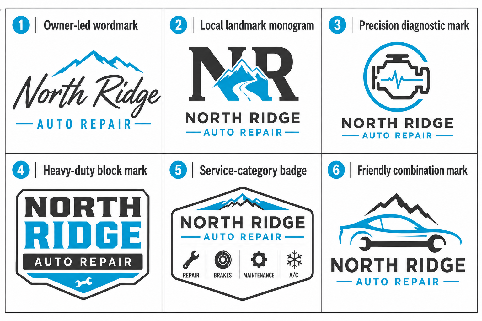
Use these directions as starting points for a custom brief, not as templates to copy. Each one should still pass the sign, mobile, uniform, and one-color tests.
| Direction | Best fit | What makes it ownable |
| Owner-led wordmark | Neighborhood general repair | A distinctive family or founder name with custom letter details |
| Local landmark monogram | One-market independent shop | Initials combined with a restrained local shape or street reference |
| Precision diagnostic mark | Electrical, European, or diagnostic specialist | Clean geometry tied to testing, data, or a specific capability |
| Heavy-duty block mark | Diesel, fleet, truck, or trailer repair | Wide lettering and a compact symbol that survives vehicle graphics |
| Service-category badge | Performance, restoration, or heritage shop | A simplified badge with one specialty cue and no service list |
| Friendly combination mark | Family-focused maintenance shop | Readable name plus a simple, approachable symbol without cartoon clutter |
For broader positioning, colors, signage, uniforms, and customer touchpoints, continue with Element DMA’s local auto repair brand guide.
Three Before-and-After Decisions
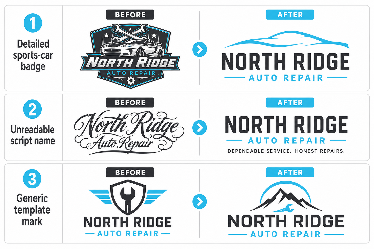
These fictional examples show how to improve common auto repair shop logo ideas without making them more complicated.
Before: the detailed sports car badge
The original concept uses a shaded car illustration, two crossed wrenches, a five-word tagline, and four colors. At profile-image size, it becomes a dark circle.
After: keep the shop name in a strong wordmark, reduce the vehicle to one simple line, and move the tagline into marketing materials. The compact version uses the first letter plus the same line detail.
Before: the unreadable script name
The owner’s signature feels personal but becomes difficult to read from the road.
After: use the signature only as an accent or founder mark. Set the actual business name in a clear typeface and give “Auto Repair” enough size to establish the category.
Before: the template everyone can buy
The concept is clean, but the same wrench-and-shield icon appears across stock libraries and local competitors.
After: retain the simple geometry while replacing the generic icon with an element tied to the shop’s name or specialty. This makes the identity easier to own and less likely to be confused with another business.
Check Availability Before You Roll It Out
A domain search is not a trademark clearance search. Before investing in a final auto mechanic logo, search business names, local listings, social handles, state registrations, and the federal trademark database. The USPTO explains that a federal search is only one part of a comprehensive clearance process, and design elements may need to be searched as well as words.
For a high-stakes name or a planned multi-location brand, involve a qualified trademark attorney. A designer can prepare original work, but legal clearance is a separate responsibility.
Use This Logo Approval Scorecard
Score each finalist from 0 to 2. A score of 0 means the concept fails the test, 1 means it needs revision, and 2 means it is ready.
| Criterion | Approval question | Score |
| Shop name | Can a new customer read the name first? | 0-2 |
| Category | Is it clear this is an automotive service business? | 0-2 |
| Distance | Does it survive a roadside-sign test? | 0-2 |
| Mobile | Is it recognizable at profile-image size? | 0-2 |
| One color | Does it work in black or white only? | 0-2 |
| Production | Can it print, cut, and embroider cleanly? | 0-2 |
| Originality | Is it distinguishable from local competitors? | 0-2 |
| Flexibility | Are horizontal and compact versions available? | 0-2 |
| Ownership | Are source files, fonts, and usage rights documented? | 0-2 |
| Longevity | Can the mark work without a trend effect or service list? | 0-2 |
Treat 17-20 as approval territory, 13-16 as revision territory, and 12 or less as a signal to reconsider the direction. A high score does not replace trademark review, but it prevents aesthetic preference from being the only decision rule.
Give the Designer a Repair-Shop-Specific Brief
Before requesting concepts, document the business problem in one page:
- exact shop name and any approved short form;
- primary services and vehicle types;
- service area and whether expansion is planned;
- desired position, such as approachable general repair, premium European specialist, fleet-focused diesel, or collision expert;
- the three most important applications;
- local competitors the mark must not resemble;
- symbols, colors, and claims that are prohibited;
- required horizontal, compact, one-color, and reversed versions;
- ownership, source-file, font-license, and revision expectations;
- the scorecard that will decide approval.
This brief keeps the process focused on business use. It also gives the designer a reason to reject a visually attractive direction that will fail on the building, website, or uniform.
Request the Complete File Package
Final logo delivery should include editable vector files, web formats, transparent-background versions, color specifications, font information, spacing guidance, and the approved variants. Confirm in writing who owns the final artwork and whether any stock asset or font license limits its use.
Create a one-page brand sheet showing correct logo use, colors, fonts, and minimum size. That sheet becomes the reference for sign vendors, uniform suppliers, printers, social media managers, and the team responsible for your auto shop website design.
Case Study Lesson: A Logo Has to Enter a Measured System
Element DMA’s Kent Auto Body Repair case study describes a shop that started without prior agency support or call tracking and later used structured campaigns and attribution. The published results are marketing results, not evidence that a logo caused calls. The useful branding lesson is that visual identity must work inside a larger system: website, ads, profile, call tracking, and customer experience all need to identify the same business clearly.
A new logo cannot compensate for an unclear website or missed calls. It can make every customer touchpoint more coherent when the rest of the system is built correctly.
Frequently Asked Questions
What should a car repair shop logo include?
Usually the shop name, a readable type treatment, and an optional category or specialty cue. It does not need a full service list, phone number, address, or several automotive icons.
Are red and black the best colors for an auto repair logo design?
They are common, not automatically best. Choose a limited palette that contrasts well, fits the shop’s positioning, and remains consistent on signs, uniforms, print, and digital channels.
Should a mechanic shop logo use a wrench or gear?
It can, but the symbol should support recognition rather than replace it. A familiar category cue is useful; a stock icon that looks like every competitor is not.
How many logo versions does an auto shop need?
At minimum, request horizontal and compact layouts plus full-color, black, and white versions. A separate small symbol or monogram is useful for profile images and favicons.
When should a repair shop redesign its logo?
Redesign when the current mark is unreadable, technically unusable, confusingly similar to another business, inconsistent with the shop’s name, or blocking a broader brand rollout. Do not redesign only because the owner is bored with it.
Approve the System, Not Just the Picture
Good car repair shop logo ideas become valuable only after they pass practical tests. Start with the sign, mobile profile, uniform, estimate, and website. Remove detail until the name stays clear. Check originality and ownership before rollout, then give every vendor the same approved files and rules.
Element DMA can connect the identity to a conversion-focused repair-shop website and consistent digital presence. The objective is not decoration. It is a brand customers can recognize before they decide to call.