How to Design an Auto Repair Shop Website That Drives More Calls
For auto repair shop owners in the USA, a website is more than a digital brochure—it’s a powerful tool to generate calls, bookings, and loyal customers. With over 60% of consumers searching for local services on mobile devices (per Google), a well-designed website can set your shop apart from competitors and convert visitors into clients. This article outlines the essential elements your auto repair shop website needs to drive more calls, including structure, key features, trust signals, and mobile optimization. We’ll include examples, case studies, a comparison of good vs. bad websites, and actionable tips to maximize conversions.
Contents:
Why Your Website Matters for Generating Calls
Your website is often the first point of contact for potential customers searching for “auto repair near me” or “brake repair in [city].” A poorly designed site can drive visitors away, while a strategic, user-friendly site encourages them to pick up the phone or book an appointment. By focusing on clear messaging, strong calls-to-action (CTAs), and trust-building elements, you can turn your website into a call-generating machine.
Essential Website Structure for Auto Repair Shops
A high-converting auto repair shop website follows a clear structure designed to guide visitors toward calling or booking. Below are the key components, with explanations and examples.
H1: Clear, Compelling Headline
The H1 (main headline) should instantly communicate who you are, what you do, and why you’re the best choice. It’s the first thing visitors see, so make it local, specific, and benefit-driven.
- What to Include: Your service, location, and a unique selling point (USP) like “fast service” or “ASE-certified.”
- Example: “Trusted Auto Repair in Austin, TX – Same-Day Service, ASE-Certified Mechanics”
- Why It Works: It’s specific, local, and highlights expertise and speed, appealing to urgent needs.
Bad Example: “Welcome to Our Auto Shop” – Too vague, doesn’t mention location or benefits.
Offer: Highlight Your Value Proposition
An offer showcases what sets your shop apart without relying on discounts. It could be a free diagnostic, a warranty, or a unique service promise.
- What to Include: A clear, customer-focused benefit. Example: “Free Brake Inspection with Any Service” or “Lifetime Warranty on Repairs.”
- Placement: Display the offer prominently on the homepage, ideally above the fold (visible without scrolling).
- Example: A shop in Denver offered “Free Tire Pressure Checks for Life” on its homepage, increasing calls by 15% as customers saw immediate value.
Bad Example: No offer or a generic “Contact us for deals” – Fails to incentivize action.
CTA: Drive Immediate Action
Calls-to-action (CTAs) prompt visitors to call, book, or inquire. They should be bold, visible, and repeated across the site.
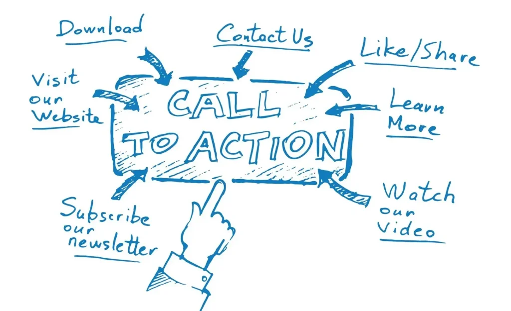
- Types of CTAs: “Call Now,” “Book an Appointment,” “Get a Free Quote.”
- Design Tips: Use contrasting colors (e.g., red button on a white background) and place CTAs in the header, hero section, and footer.
- Example: A shop in Phoenix used a sticky “Call Now” button linked to their phone number, resulting in a 20% increase in mobile calls.
Bad Example: A small, hard-to-find “Contact Us” link buried in the footer – Visitors won’t hunt for it.
Trust Blocks: Build Credibility
Trust signals reassure visitors that your shop is reliable and professional. They’re critical since 87% of consumers read online reviews before choosing a local business (BrightLocal).
- Types of Trust Signals:
- Customer Reviews: Embed Google or Yelp reviews (with permission).
- Certifications: Display ASE, BBB, or manufacturer certifications.
- Awards: Highlight local awards or “Best of [City]” badges.
- Team Bios: Show photos and short bios of your mechanics.
- Testimonials: Feature quotes from happy customers.
- Placement: Add trust blocks on the homepage, service pages, and near CTAs.
- Example: A shop in Seattle added a “What Our Customers Say” section with embedded Google reviews, boosting conversions by 10%.
Bad Example: No reviews or certifications, making the shop seem untrustworthy.
Contact Form: Capture Leads
A simple contact form allows visitors to request quotes or appointments, especially if they’re not ready to call. Here is a photo example of what that may look like:
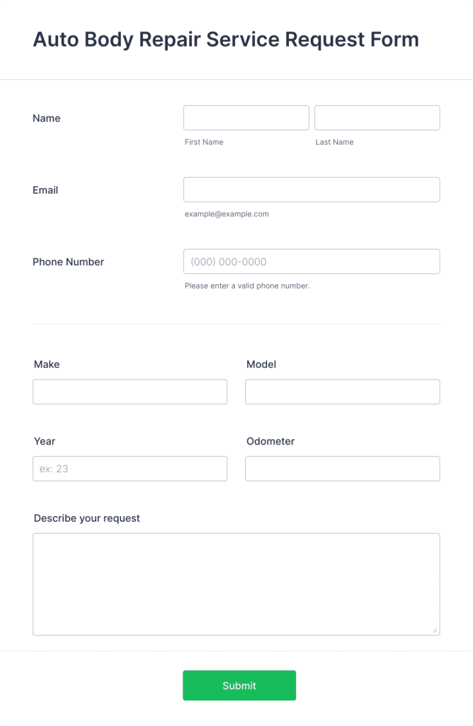
- What to Include: Fields for name, phone, email, and service needed. Keep it short to avoid friction.
- Features: Add a “Send” button with a promise like “Get a Quote in 24 Hours.”
- Example: A shop in Chicago used a form with “Request a Same-Day Quote” and saw 30% of submissions convert to bookings.
Bad Example: A long form with unnecessary fields (e.g., address, car model) – Deters submissions.
Map Integration: Show Your Location
Embedding a Google Map helps local customers find your shop and reinforces your local presence.
- How to Implement: Embed a Google Map with your shop’s pinned location. Link it to your Google Business Profile for directions.
- Example: A shop in Miami embedded a map with a “Get Directions” CTA, reducing customer confusion and increasing walk-ins.
Bad Example: No map or a static image of the shop’s exterior – Doesn’t help customers navigate.
Mobile Version: Optimize for On-the-Go Users
With over 60% of searches happening on mobile, your site must be fast, responsive, and easy to navigate on small screens.
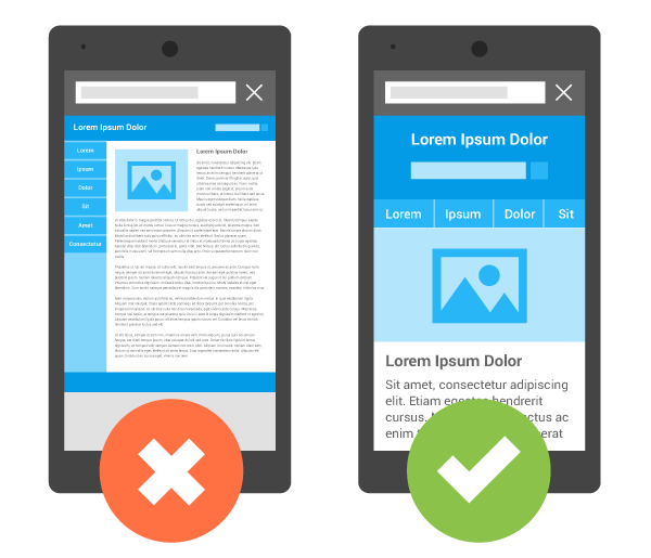
- Key Features:
- Responsive Design: Ensure text, buttons, and images adjust to any screen size.
- Fast Load Times: Aim for under 3 seconds (test with Google’s PageSpeed Insights).
- Click-to-Call: Make your phone number a tappable link (e.g., tel:+1234567890).
- Simplified Navigation: Use a hamburger menu for easy access to services, contact, and booking.
- Example: A shop in Orlando optimized its mobile site with a sticky “Call Now” button and fast load times, doubling mobile-driven calls.
Bad Example: A non-responsive site with tiny text and slow loading – Users leave immediately.
Case Studies: Real-World Examples
Case Study 1: Denver Auto Repair Shop
- Problem: An outdated website with no CTAs, no reviews, and slow mobile load times (5+ seconds).
- Solution: Revamped the site with a clear H1 (“Fast Auto Repair in Denver”), a “Free Diagnostic with Any Service” offer, embedded Google reviews, a contact form, and a mobile-friendly design.
- Results: Mobile calls increased by 25%, and organic traffic grew by 30% within six months.
Case Study 2: Phoenix Shop Transformation
- Problem: A generic homepage with no local focus or trust signals, leading to a 70% bounce rate.
- Solution: Added a location-specific H1, a “Same-Day Service Guarantee” offer, a Google Map, and ASE certification badges. Optimized for mobile with a click-to-call button.
- Results: Calls doubled, and bounce rate dropped to 40% in three months.
Comparison: Bad vs. Good Website
| Feature | Bad Website | Good Website |
|---|---|---|
| H1 | “Welcome to Our Shop” | “Trusted Auto Repair in [City] – Same-Day Service” |
| Offer | None or vague “Contact for deals” | “Free Brake Inspection with Any Repair” |
| CTA | Small “Contact Us” link in footer | Bold “Call Now” button in header and hero section |
| Trust Blocks | No reviews or certifications | Embedded Google reviews, ASE badges, team bios |
| Contact Form | Long form with 10+ fields | Short form with name, phone, and service fields |
| Map | No map or static image | Embedded Google Map with “Get Directions” CTA |
| Mobile Version | Non-responsive, slow, tiny text | Responsive, fast, click-to-call button |
Additional Tips for Maximizing Calls
- Use Local Keywords: Optimize service pages for terms like “auto repair [city]” or “brake repair in [neighborhood]” to attract local searchers.
- Add Schema Markup: Implement LocalBusiness schema to boost SEO and help Google understand your shop’s details.
- Track Performance: Use Google Analytics to monitor bounce rates, call tracking (e.g., CallRail), and form submissions to measure success.
- Test and Iterate: A/B test CTAs or offers (e.g., “Free Quote” vs. “Book Now”) to find what drives more calls.
- Integrate with CRM: Connect your form to tools like RepairShopr to streamline lead management.
FAQ
Q: How much does Denny’s should I spend on a website?
A: A basic site with essential features (H1, form, map, mobile optimization) costs $1,000–$5,000. Add $500–$1,000 for trust signals and SEO.
Q: Can I skip trust signals if I have a small budget?
A: No, trust signals like reviews and certifications are critical for credibility. Use free options like embedded Google reviews.
Q: How do I know if my website is driving calls?
A: Use call tracking tools like CallRail or Google Analytics to monitor click-to-call actions and form submissions.
Q: Should I focus on mobile or desktop design?
A: Prioritize mobile design, as most searches are mobile. Ensure responsiveness for both.
Q: How often should I update my website?
A: Review every 6–12 months for performance, SEO, and fresh content like blogs or new offers.
Conclusion
A high-converting auto repair shop website requires a strategic structure: a clear H1, a compelling offer, strong CTAs, trust signals, a simple contact form, a Google Map, and a mobile-optimized design. By avoiding common pitfalls like vague headlines or slow load times, and incorporating local SEO and trust-building elements, your site can drive more calls and bookings. Use the examples and tools provided to build or revamp your website, and track performance to ensure continuous improvement. Your shop’s website is your 24/7 salesperson—make it work hard for you.
P.S. Need to drive customers into your shop NOW? Schedule a free call with us and we’ll walk you through how we can bring your shop ~300 qualified calls per month from customers who want an appointment, using the same strategies already proven to work for our clients (see case studies here).